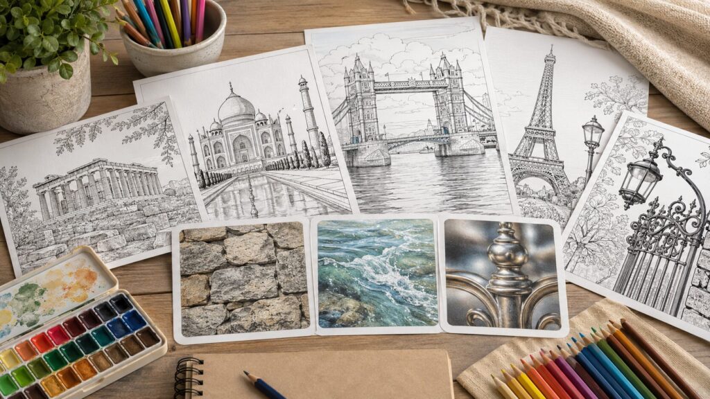
Stone is not just gray.
Water is not just blue.
Metal is not simply yellow, silver, or black.
This is one of the small surprises that makes world landmark coloring pages so enjoyable.
A castle wall, a canal, a bridge railing, a dome, a fountain, and an old stone street may all appear in one illustration.
When each part is colored with only one flat color, the page can look a little heavy or unfinished, even when you have taken your time.
The good news is that you do not need advanced art skills to make these materials feel more believable.
A few gentle choices can make a big difference: avoid filling everything with one color, save a little white for light, and use soft shadow colors instead of relying only on black.
In this guide, you will practice simple ways to color stone, water, and metal with colored pencils so your world landmark pages feel more atmospheric, dimensional, and fun to finish.
If you would like to start with the bigger picture of world landmark coloring, this guide may also be helpful.
Related article: World Landmark Coloring Guide
The Basic Rule of Texture: Do Not Start with “Perfect Color”
When beginners color world landmarks, it is natural to look for the correct color first.
What color is an old castle? What color is a canal? What color is a bronze statue? But texture often depends less on the name of the color and more on how the color is placed.
Stone feels more natural when gray is mixed with beige, light brown, or blue-gray.
Water feels lighter when some white paper is left for sparkle and reflection.
Metal looks more reflective when a bright area sits next to a darker area.
Before you begin a detailed landmark page, try to remember one simple idea: each material needs a base color, a shadow color, and a small area of light.
You can do a lot with just those three parts.
Use More Than One Color for Each Material
A flat result often happens when one material is colored with only one pencil.
Gray stone, blue water, and yellow gold are easy starting points, but they rarely create enough depth on their own.
For stone, start with a pale gray and add small touches of beige, ocher, or cool gray.
For water, begin with light blue and add deeper blue only where the water is shaded or closer to the viewer.
For metal, keep a bright strip and place a darker tone beside it.
You do not need many pencils.
Three colors for one material are usually enough.
This keeps the process simple and prevents the page from becoming too busy.
Decide Where to Leave White Before You Color
Colored pencil is not always easy to erase cleanly.
Because of that, it is helpful to decide where the brightest areas will be before you start coloring.
White paper can become the sparkle on water, the shine on a metal railing, or the edge of a sunlit stone.
It does not need to be a large white space.
Even a thin line or small patch can make the whole area feel brighter.
Leaving white also gives the page room to breathe.
World landmark illustrations often have many lines and details, so a few lighter areas can make the final page feel calmer and more open.
Choose Shadow Colors Softer Than Black
Black can be useful, but it can also become too strong very quickly.
If you use black for every shadow, the page may feel heavy or outlined.
For stone, try purple-gray or blue-gray.
For water, use blue-gray or a deeper blue.
For metal, use dark gray, brown, or a cool blue-gray depending on the type of metal.
Save black for the deepest spaces, such as the inside of a dark doorway, a narrow gap under a bridge, or the very darkest part of a railing.
If you are still choosing paper, pencils, or basic supplies, this article may help before you begin.
Related article: World Landmark Coloring Supplies and Basic Techniques
How to Color Stone: Make Old Buildings Feel Warm and Dimensional
Stone appears often in world landmark coloring pages.
You may see it in castles, churches, ruins, bridges, walls, towers, and stone streets.
At first, stone may seem easy because gray feels like the obvious answer.
But old stone usually has more than one color inside it.
Think of stone as something that has been touched by weather, time, dust, and light.
A wall may be gray, but the lower part may look a little brown.
A corner may look cooler and darker.
A stone street may have one tile that is slightly warmer than the next.
You do not need to draw every crack.
A few color changes and small shadows can make stone feel much more natural.
A Simple Step-by-Step Method for Walls, Castles, Churches, and Ruins
Start with a very light layer of gray.
Keep your hand gentle.
At this stage, the goal is not to finish the stone, but to create a soft base.
Next, add a little ocher, beige, or light brown in selected places.
Good spots include the bottom of a wall, the side of a doorway, the corner of a tower, or areas that might look older and weathered.
Do not cover everything.
A few uneven touches are enough.
Then add a cooler shadow color, such as blue-gray or purple-gray, under windows, beneath roof edges, inside arches, and near deep lines.
Finish by making only a few edges darker.
Corners, window frames, and the base of a wall are good places to add definition.
A useful order is: light gray, warm weathered color, cool shadow, and small dark accents.
This order helps you build depth without making the page too dark too soon.
Do Not Color Every Stone Tile the Same Way
Stone streets and stone paths can become tiring if you try to color each piece perfectly.
Instead, begin with a light gray layer over the whole area.
Then choose only a few stones and add beige, pale brown, or blue-gray.
You might color three or four stones differently out of ten.
That is enough to create variety.
Stones closer to the front of the page can be a little darker, while stones in the distance can stay lighter.
This simple difference helps the path feel like it is moving away from you.
Try not to darken every line between the stones.
If every gap is black, the stone path may look too heavy.
Use darker lines only in the foreground or in areas where you want extra focus.
Add Small Shadows Instead of Heavy Outlines
Stone looks dimensional when shadows are placed in small, believable areas.
Look for places that would naturally be slightly hidden from light: under a ledge, inside a window frame, on one side of a column, or at the back of a step.
Instead of tracing every printed line, place a soft shadow just inside one edge.
Use a light hand and build the color slowly.
Small shadows often look more natural than one large dark area.
Common Mistake: Making Stone Too Black
It is tempting to strengthen a detailed stone building with black.
But if every window, crack, and outline becomes black, the page can lose its soft travel atmosphere.
Try dark gray or purple-gray first.
Use black only for the deepest parts, such as a dark doorway or the inside of an arch.
This keeps the building strong without making it feel harsh.
If you enjoy stone architecture, this related article focuses more deeply on UK landmarks and stone buildings.
Related article: How to Color UK Landmark Coloring Pages with Stone Architecture and Red Accents
How to Color Water: Let It Reflect Sky, Light, and Surroundings
Water can change the mood of a landmark coloring page.
A canal can make a city feel quiet.
A lake can add space.
The sea can bring movement.
A fountain can make a square feel bright and lively.
The easiest mistake is to color all the water with a strong blue.
Real water is often not simply blue.
It reflects the sky, nearby buildings, trees, shadows, and light.
Once you think of water as a reflective surface, it becomes much easier to color.
Change Your Approach for Canals, Lakes, Seas, and Fountains
A canal often reflects buildings.
After adding a light blue base, try adding a few vertical strokes using colors from the buildings nearby, such as beige, brown, or muted red.
Keep the lines short and slightly broken so they look like reflections, not solid objects.
A lake often reflects the sky.
Use pale blue across the surface and keep the far area lighter.
Add slightly deeper blue only near the front or in shaded areas.
The sea usually needs a sense of distance.
Keep the horizon or far water lighter, and make the front a little deeper.
Instead of filling the whole sea with dark blue, use stronger color only in selected wave shadows.
A fountain is often more about white space than blue color.
Leave the spray and highlights mostly white.
Add pale blue or blue-gray around them so the white areas begin to look like moving water.
Use Short Horizontal or Vertical Lines for Reflections
For a quiet lake or calm sea, short horizontal lines are useful.
Move your pencil gently across the page, leaving small breaks between strokes.
You do not need to draw every wave.
A few soft lines can suggest the water surface.
For canals or city reflections, vertical strokes can work well.
Pull the color downward from the building or bridge, then break the line before it becomes too long.
Reflections are usually uneven, so broken lines look more natural than perfect stripes.
Save White for Sparkle, Waves, and Fountain Spray
White space is one of the easiest ways to make water feel alive.
Leave thin white lines for sparkling light, wave edges, or fountain spray.
Then add pale blue beside the white areas.
The blue makes the white look brighter.
If the water already feels too dark, avoid adding more dark blue.
Instead, balance the page by strengthening nearby buildings, sky, or shadows.
Sometimes the best correction is not inside the water itself, but around it.
Common Mistake: Coloring Water Too Dark Too Early
Water can become heavy when dark blue is used at the beginning.
Start with the lightest blue you have and build slowly.
Add darker color only under bridges, near the foreground, around reflected buildings, or in deeper water.
This gentle approach gives you more control and keeps the water open and bright.
How to Color Metal: Create Shine with Light and Dark Bands
Metal often appears in small but important details: bridge railings, street lamps, statues, gates, bells, domes, and decorative parts of palaces or temples.
These areas may be small, but they can become beautiful accents when colored carefully.
The key to metal is contrast.
A metal surface looks shiny when a light area sits beside a dark area.
If the entire object is colored evenly, it will look flat, even if the color itself is correct.
Think Simply About Gold, Silver, and Iron
Gold is not only yellow.
Start with yellow, add ocher or light brown for shadow, and leave a small white highlight.
This works well for palace details, temple ornaments, decorative gates, and small accents.
Silver is not only gray.
Use pale gray as the base, add blue-gray for the darker side, and leave a white highlight.
This gives the metal a cooler shine.
Iron can be colored with dark gray, but it often looks better with a little blue or brown mixed in.
For old bridges, gates, and street lamps, dark gray is usually softer and more natural than pure black.
Use a Bright Band and a Dark Band
To make metal shine, leave a narrow bright band.
Place a darker color right next to it.
The closer the light and dark areas are, the stronger the shine will appear.
For a gold railing, leave a small white strip, add yellow around it, and place brown or ocher on one side.
For a silver railing, leave white on one side and add blue-gray on the opposite side.
Even a tiny object can look metallic with this simple pattern.
Tips for Street Lamps, Railings, Statues, and Domes
For thin metal objects like railings and street lamps, do not try to color every side.
Shade only one side of the line.
This can create a rounded look without complicated blending.
For statues, avoid making the whole figure too dark.
Add shadow under the chin, arms, folds, base, and deeper areas.
If you want an aged bronze feeling, a tiny touch of dark green or blue-green can be added, but use it lightly.
For domes, decide where the light comes from before coloring.
Keep the top or one side brighter and make the opposite side darker.
A dome becomes easier to understand when the light direction is clear.
Common Mistake: Coloring Gold with Yellow Only
Yellow alone can look cheerful, but it may not look like metal.
To create gold, combine yellow with ocher, brown, and a white highlight.
For small decorative parts, you do not need many details.
A little light, a little yellow, and a little shadow are often enough.
A 10-Minute Practice: Try Stone, Water, and Metal in Small Areas
Before you test a new technique on a finished landmark page, try a small practice square.
This removes pressure and helps you understand how your pencils behave on the paper.
Practice 1: A Small Stone Wall with Three Colors
Draw a small square or rectangle.
Cover it lightly with pale gray.
Add ocher near the bottom or one corner.
Then add purple-gray or blue-gray along one side.
This small shape will begin to feel like a stone block.
If you want to practice more, draw several blocks together and change the color of only a few of them.
Practice 2: A Water Surface with Sky Blue and White Space
Draw a long rectangle.
Leave a few thin white spaces and lightly color around them with pale blue.
Add slightly deeper blue near the front edge.
Finish with a few short horizontal lines.
This simple practice helps you understand sparkle, waves, and reflections before working on a lake, canal, or sea.
Practice 3: A Metal Railing with Light and Shadow
Draw a narrow bar.
Leave a thin white strip in the center or along one side.
Add yellow and brown for gold, or pale gray and blue-gray for silver.
Because metal details are often small, the contrast should be clear enough to see.
You do not need to blend everything perfectly.
Choose One Main Texture for Each Landmark Page
Some world landmark coloring pages include stone, water, metal, trees, sky, windows, and people all in one scene.
When everything looks important, it can be hard to know where to begin.
A helpful approach is to choose one main texture for the page.
For European streets, castles, churches, or old towns, make stone the main texture.
Give the walls and streets gentle color variation, then keep smaller details quieter.
For waterfront cities, canals, harbors, or lakeside views, make water the main texture.
You do not need to color every building heavily if the reflections and light on the water create the mood.
For temples, palaces, towers, bridges, or historic gates, use metal as an accent.
A small amount of gold, silver, bronze, or iron can guide the eye and make the page feel more finished.
Choosing a main texture does not mean ignoring everything else.
It simply gives the page a clear focus.
Some areas can be detailed, and other areas can stay soft.
How to Use Free Printable Practice Pages
Stone, water, and metal practice works especially well with printable coloring pages or small downloadable samples.
You can use one copy for testing colors and another copy for the final version.
This is helpful because colored pencil changes as you layer it.
A gray that looks too plain at first may become beautiful with beige or blue-gray over it.
A blue that looks strong alone may work well when placed beside white highlights.
When practicing, focus on one small improvement at a time.
Maybe the stone looks less flat than before.
Maybe the water has a little sparkle.
Maybe the railing finally looks shiny.
These small wins are what make coloring more enjoyable and easier to continue.
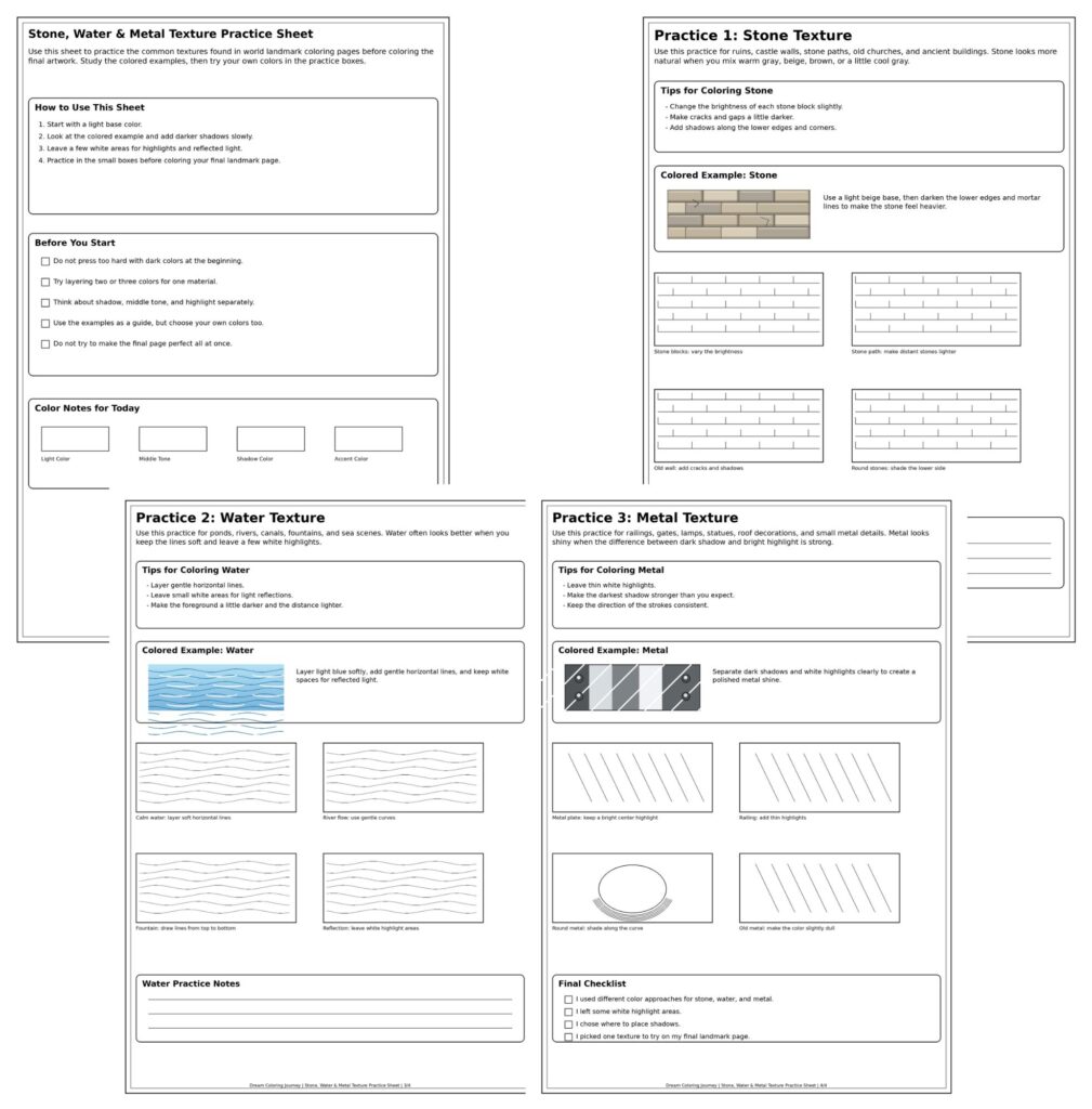
This free sheet helps you gently practice the textures often used when coloring world landmarks: stone, water, and metal.
・Stone texture, water texture, and metal texture practice with colored examples
FAQ
Do I need to make every texture realistic?
No.
You do not need full realism to enjoy world landmark coloring pages.
A little texture is enough.
Add slight color variation to stone, save white for water, and create light and dark bands for metal.
These small choices can change the whole page.
Can I do this with a small set of colored pencils?
Yes.
A small set can work well.
Light gray, blue, yellow, brown, and a dark neutral color are enough for many basic effects.
You can create variety by changing pressure, layering colors, and leaving white paper visible.
What should I do if I make an area too dark?
Do not panic.
If water becomes too dark, strengthen nearby shadows or buildings so the balance feels intentional.
If stone becomes too heavy, add warmer tones around it to soften the effect.
If metal loses its highlight, make the shadow next to the brightest area a little darker so the light appears stronger.
Conclusion
World landmark coloring pages can feel complicated because they often include many lines and materials.
But once you separate the page into stone, water, and metal, the process becomes much easier.
Stone does not need to be flat gray.
Add soft beige, light brown, or blue-gray to make it feel older and more natural.
Water does not need to be solid blue.
Leave white for light and use short lines for reflection.
Metal does not need to be filled with yellow or gray.
A bright band beside a dark band can create a simple shine.
You do not have to master everything at once.
Start with one stone wall, one small water reflection, or one railing.
Each little practice helps the next landmark page feel more alive.
The next time you open a world landmark coloring page, look at the scene first and gently ask: What is stone here? What is water? What is metal? That small pause can make coloring feel calmer, clearer, and much more enjoyable.
Practice Stone, Water, and Metal on Real World Landmarks
Apply these texture techniques to landmark scenes with a print book or a downloadable PDF collection.
- Amazon (Print Book): World Heritage Wonders on Amazon
- Gumroad (Printable PDF): Download World Heritage Journey PDF