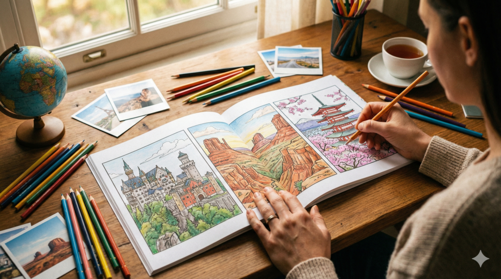
Travel is fun—but honestly, the getting around can be the hardest part.
With coloring, though, you can travel the world from your desk. And once you decide the order of your colors, it’s surprisingly easy to bring out the “feel” of a landmark.
This page is a “travel-through-coloring” guide designed to solve country-by-country problems like:
“I want my landmarks to look great, but the stone looks flat… the water turns muddy… the gold and vermilion of temples and shrines look cheap…”
Bottom line: most hesitation stops right here 👇
- Choose your base colors (the foundation layers).
- Add accent colors (a hint of climate and culture).
- Finish with shadow colors (the core of depth and dimension).
Table of Contents (Jump to Any Section)目次
- ravel Coloring: The Fastest Setup to Make It Look “Right”
- Europe: Stone Architecture Textures (UK, Norway, Iceland)
- North America: The Power of Nature (National Parks & City Night Views)
- Asia: Traditional Japanese Colors & Seasonal Palettes (Four Seasons etc)
- Color Palette Recipes (Quick Wins When You’re Stuck)
- Country-by-Country Sample Download (1 Free Page)
- Gallery & Submissions (Hashtag Project)
- Recommendations (Print / PDF)
- FAQ
- Related Links (Internal Links)
ravel Coloring: The Fastest Setup to Make It Look “Right”
1)If you decide the “texture” first, your color choices won’t drift.
World landmarks can look so vibrant in photos—but when you color them, they often turn out surprisingly flat.
The reasons are usually these:
- Stone → painted in just one gray
- Water → painted in just one blue
- Gold → painted in just one yellow
So first, decide what each area is:
“Is this stone? wood? metal? water? sky? greenery?”
Then give yourself simple rules for how you’ll color each texture.
2)The “3-Color Rule” for Fast, Eye-Catching Results
When in doubt, start with just three colors—no matter the country.
- Base colors: the “atmosphere” of the country (muted or vibrant?)
- Accent colors: moss, vermilion, window lights, reflections—one punch of “local character.”
- Shadow color: the core that creates depth (a blue-purple or purple-gray is a reliable all-rounder).
Once you decide this much, landscape coloring suddenly becomes a lot easier.
3)Don’t treat the paper’s white as a “final highlight”—plan to leave it from the start.
Especially for snow, clouds, sea spray, and shiny metal, it usually works better to preserve the white than to try to color it in.
Europe: Stone Architecture Textures (UK, Norway, Iceland)
The key to coloring European landmarks, in one sentence, is this: think of stone as being made of “tiny grains.”
Instead of a flat, single gray, use subtle variations across multiple close colors to create the unevenness of age—and the architecture suddenly comes to life.
Europe (General): How to Color Stone (Basic Steps)
- Lay down a soft, light gray base. (For a cooler look, use a pale bluish gray.)
- On top, sprinkle “grain” with warm gray / ochre / a tiny touch of purple using a light, speckled texture.
- Tighten corners, joints, and carvings with a shadow color using a thin line (don’t make it thick).
- Leave a bit of the paper’s white along edges or trace a very faint white line to add a hint of light.
UK: Quiet Overcast Skies + a Hint of Moss
British stone architecture—like the Tower of London or Westminster Abbey—looks best with a slightly damp, misty atmosphere.
- Sky: Blue-gray with a tiny touch of purple (lean into a calm, quiet mood)
- Stone walls: Cool grays as the base, with light washes of mossy olive in places
- Window frames / lead: Build layers from mid-gray → dark gray
- Glass: Use sky tones plus white reflections with diagonal strokes
Greenery (lawns / ivy): A single green can look flat—create depth in three steps: yellow-green → green → deep green to bring out the local climate feel
Norway: Cold Air + Water Reflections
If you’re coloring fjords or wooden architecture (like stave churches), the star of the show is the crisp coldness of the air.
- Water: Lay a light wash of cyan-leaning blue, then add shoreline reflections with vertical strokes to create gentle movement
- Rock surfaces: Mix in about 10–20% blue/green into your grays, and leave bits of white for wet reflections
- Wood: Layer ochre → dark brown to suggest grain rings and shadow
- Snow: Don’t color the white—leave it. Add only shadows in blue-purple
Iceland: Bold Contrast of Black and Ice
With black-sand beaches and ice caves, contrast is the winning strategy.
- Black sand: Not pure black—build depth with dark gray + blue-purple
- Ice: Layer pale light blue → neutral gray tones → white, and add blue-gray shadows in cracks
- Steam / fog: Use the paper’s white plus a very light blue-gray wash—this is how you “draw the invisible.”
North America: The Power of Nature (National Parks & City Night Views)
In North American landscape coloring, it’s not the colors themselves—it’s the sense of scale (vastness) that matters most.
The tip is simple: reduce saturation and contrast as things go farther into the distance.
Then place warmer tones or deeper shadows only in the foreground, and the scene instantly gains depth.
National Parks: Color Rock Layers as “Warm Stacked Bands”
For Grand Canyon– or Yosemite-level rock formations, simply layering color along the direction of the strata will create instant dimension.
- Strata palette: ochre → brick → red-brown → dark brown
- Shadows: cool them down with a purple-leaning shadow tone (it tightens the rock)
- Sunlit areas: warm them up with orange-leaning tones (adds thickness and weight)
For waterfalls, leave white splashes. Keep the center of the falling water brighter and the edges slightly darker to create depth.
City Night Views: Create Rhythm with Just 3 Window Colors
Skyscrapers make you want to add tons of detail—but the more window colors you use, the messier it gets.
For night scenes, this is enough 👇
- 3 window-light colors:
Yellow (warm) / White (neutral) / Blue-white (cool) - Ratio: keep it around 6 : 3 : 1 (decision-making disappears)
- Reflections: stretch the same window colors vertically or diagonally
For the sky, use a gradient from ultramarine → deep navy.
Add just a touch of purple along the edges of clouds, and the night atmosphere suddenly feels richer.
Asia: Traditional Japanese Colors & Seasonal Palettes (Four Seasons, Shrine Gold & Vermilion)
Asian landmarks don’t just show scenic beauty—they also carry the texture of culture.
The shortcut is using traditional Japanese colors—vermilion, indigo, fresh green, madder red, and gold. Layer them with seasonal palettes, and that “travel mood” appears almost automatically.
Seasonal Color Quick Guide (rough)
Spring:
- Cherry blossoms: leave the paper white + pale pink, then deepen the center for a soft “bleeding” effect
- Fresh greens: yellow-green → green
Summer:
- Sky: bright, high-value cyan-leaning tones
- Shade: use blue-green shadows to create a temperature contrast
Autumn:
- Foliage: mottled layers of yellow → orange → vermilion → deep crimson
- Structure: unify the base with dark brown
Winter:
- Snow: leave whites untouched + add blue-purple shadows
- Bark: support with cool grays
Shrine Gold & Vermilion: How to Avoid a “Cheap” Look
For gold, don’t just “color it yellow.”
If you show it with bands of light and shadow plus tiny highlight dots, it instantly looks more refined.
- Gold: yellow → ochre → dark brown in shaded bands / add small white dots at the brightest points
- Vermilion: vermilion (slightly orange) → red → deep red in three steps to show the roundness of pillars
- Roof tiles: blue-gray → dark gray in layered steps / lightly scatter yellow-green or brown for moss and weathering
Color Palette Recipes (Quick Wins When You’re Stuck)
Here, I’ll summarize the “landscape basics you use every time” into quick recipes that make things look polished fast.
Water / Sky / Greenery
- Water: a vertical gradient of cyan → blue → ultramarine / leave the paper white for ripples
- Sky: bright sky blue, fading lighter toward the horizon / add a very pale gray-blue for cloud shadows
- Greenery: three tones—yellow-green (light) → mid-green (base) → deep green (shade) / use light stippling to create “leaf grain”
Stone / Wood / Metal
- Stone: cool gray base + speckles of ochre and purple for an “aged” look / add a thin white edge line (or leave white)
- Wood: ochre base → dark brown for grain rings / knots = dark oval shapes with a white rim-light
- Metal: make the light–dark bands crisp / mix cool highlights (blue-white) with warm highlights (yellow)
Country Quick Palettes (Anti-Confusion Cheat Sheet)
| Region | Base Colors | Accent Colors | Shadow Colors |
|---|---|---|---|
| UK (Stone Architecture / Overcast Skies) | Blue-gray | Mossy olive | Purple-gray |
| Norway (Cold Air / Water Surface) | Cyan-leaning blue | Leave white for wet reflections | Blue-gray |
| Iceland (Black Sand / Ice) | Dark gray | Pale light blue | Blue-purple |
| North America (National Parks / Rock Layers) | Ochre → brick | Sunlit orange | Purple shadows |
| North America (City Night Views) | Ultramarine → deep navy | 3 window-light colors | Dark gray |
| Asia (Four Seasons / Shrines & Temples) | Light ink gray / haze | Vermilion / indigo / gold | Blue-purple |
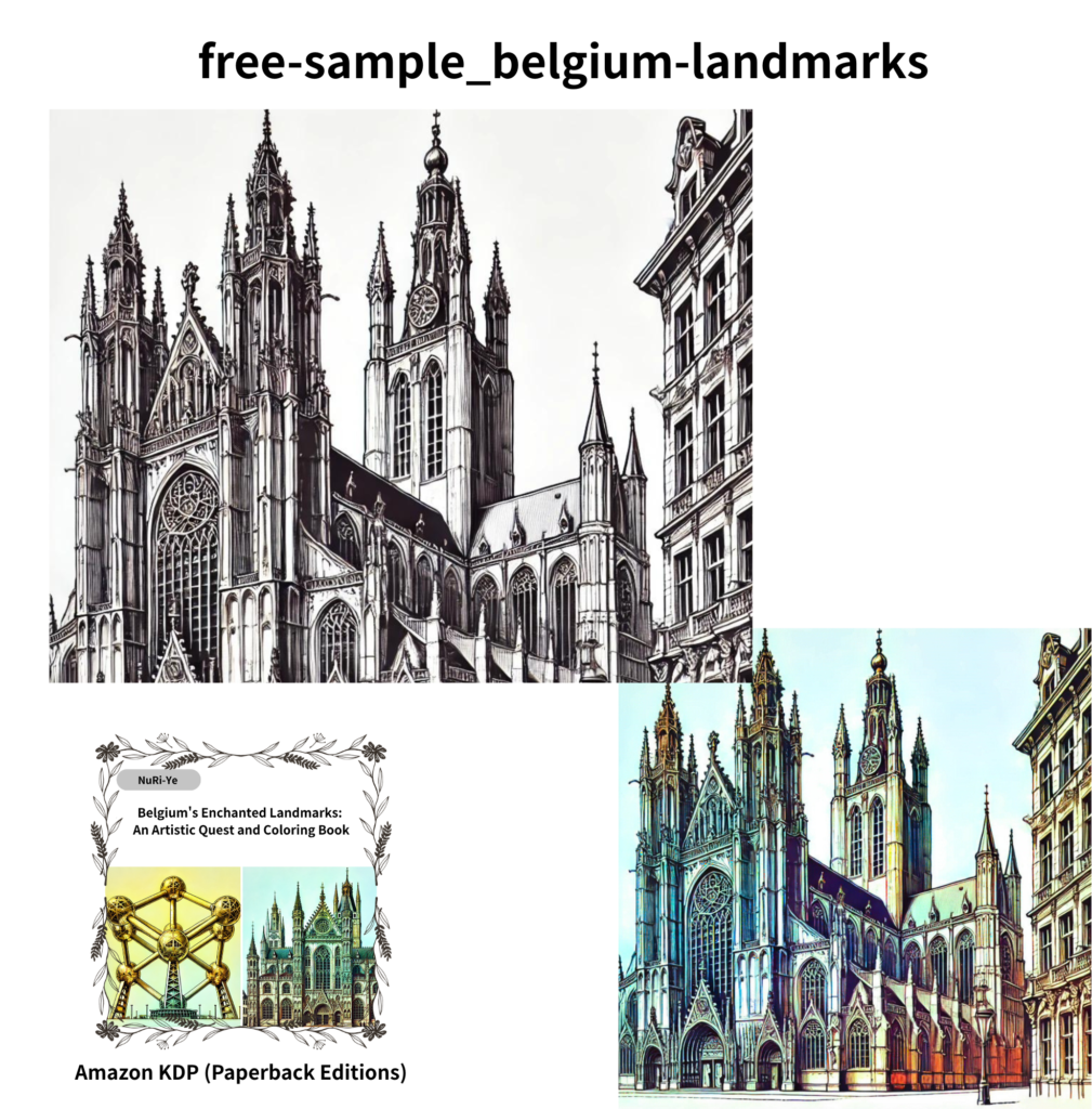
| ★ Belgium (Free Sample Edition) | Warm gray to sand beige (cobblestones / stone walls) + terracotta or brick brown (brick buildings). | Muted blue-green for canals (water surface) + muted gold for Grand-Place-style decorations. | Bluish gray to purplish gray (great for overcast skies and stone shadows). |
Country-by-Country Sample Download (1 Free Page)
We’re offering free country-based sample pages optimized for practice (for personal, at-home use only).
Free Download Box (Download → Print → Use)
【Steps】
- Download: Get the country sample page
- Print: A4 plain paper or thicker paper. Set scaling to 100–120%
- Use: Practice while referencing the color recipes on this page → share your finished work on social media
[Terms of Use] Personal, at-home use only. Redistribution, commercial use, and re-editing/reposting the files are not allowed.
【Free Download】
You can download one free sample coloring page from our Amazon paperback coloring books.
The sample PDF includes the three pages shown on the right.Please feel free to print the black-and-white line art and enjoy coloring.It also includes colored sample (finished) versions as inspiration.
・On Amazon, search using the ASIN below to find the
“Mandala” themed coloring book.
(96 pages, 24 designs, $9.99 USD)
⇒⇒ B0D9WQF79N
Gallery & Submissions (Hashtag Project)
We’re planning a hashtag-based community project using the following rules.
(The project will begin once the in-article gallery is ready. When it starts, we’ll announce it on this page.)
[Rules When the Project Begins]
・Please post your finished artwork on social media (Instagram + Pinterest) with these hashtags:
#DreamColoringJourney and #TravelColoring
・Each month, we’ll pick a “Best Travel Coloring” and feature it in the in-article gallery.
・Please note
1)Posts using the hashtags may be considered for selection.
2)If we’d like to feature your work on the blog, we’ll confirm with you via DM. (If we can’t reach you by DM, we won’t be able to include it.)
3)We’ll credit your account name when featured. (If you prefer not to be credited, we can accommodate that.)
Example Monthly Themes
If we run the hashtag project, we’ll set a simple, seasonal theme each month.
It’s totally fine if your artwork doesn’t match the theme exactly.
- January: Snow & Metal (Winter shrines/temples and city scenes)
- May: Fresh Greenery & Water (Lakes & canals)
- October: Stone & Light (Old castles & sunset scenes)
Recommendations (Print / PDF)
Once you find a country you want to color, you can start your journey right away.
- Amazon (by region): Enjoy a curated collection in print→ Here: Coloring Blog – Country Search Map
- Etsy (country PDFs): Download instantly and start your travel coloring→ Here: Etsy Digital Shop
Frequently Asked Questions (FAQ)
Q1. My stone buildings look flat. Where should I start fixing it?
A. Think in “grain.” Add speckled texture: start with a cool gray base, then lightly stipple in small touches of ochre and purple. Tighten the joints and corners with a thin shadow line. Finally, add a subtle white rim-light along edges to bring the form back.
Q2. How can I make city night window lights look cleaner? How should I decide the number of colors and their proportions?
A. Limit window lights to just three colors: yellow / white / blue-white, and lock the ratio (for example, 6:3:1). For reflections, simply stretch the same window colors vertically—instant “night city” vibe.
Q3. My water looks muddy.
A. When in doubt, reflect the sky into the water. Lay a light wash of the sky color onto the surface. Leave the paper white for wave crests, and add thin touches of ultramarine in the darker areas to sharpen and define it.
Related Links (Internal Links)
- Related: ““Preparation・Art Supplines・Basic Techniques– World Tourist Sites & Coloring”
- Related: “Color Basics: Hue, Saturation & Value” (Coming Soon)
- Related: “Texture Practice: Stone, Water & Metal” (Coming Soon)