You’ve got your colored pencils. You’ve upgraded your paper. And yet—
- “I can’t decide on a color palette.”
- “My colors start to look muddy halfway through, and I freeze.”
This is a classic coloring-book problem. I used to place my favorite colors in order and end up thinking, “Something feels off…”
But it’s not that only “talented” people have good taste.
Coloring palettes become much more stable with just three simple rulers:
- Hue distance (how close or far colors are on the color wheel)
- Value contrast (light vs. dark)
- Tone consistency (matching the overall “air”: vivid vs. muted, light vs. heavy)
In this guide, I’ll turn color-wheel basics—complementary colors and tone—into coloring-ready rules, and I’ll provide three ready-to-use recipes for: Calm / Luxury / Travel mood.
Table of Contents (Jump to Any Section)
- Conclusion first: Close hues × Add value contrast × Keep tones consistent
- Color theory in 60 seconds (for coloring)
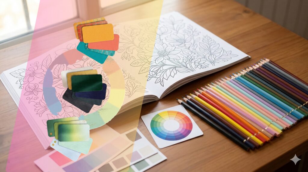
- Color wheel basics: 3 things beginners should learn first
- Color psychology: mood depends more on brightness & saturation than “color names”
- Purpose-based recipes: Calm / Luxury / Travel (ready to use)
- Preset table (copy & use)
- Free Download Box (Color Palette Template)
- FAQ
- If color choice gets easier: what to read / buy / download next
Conclusion First: Close Hues × Value Contrast × Tone Consistency
Most beginner mistakes come from these two patterns:
- Using high-saturation colors on large areas right away
- Mixing inconsistent tones (vivid next to muted, bright next to nearly black…)
So remember this:
When in doubt: keep hues close, create contrast with value, and keep tones consistent.
Research on color psychology also suggests that mood is influenced not only by hue (red/blue etc.), but strongly by brightness and saturation. In other words, even the same “blue” feels completely different depending on whether it’s light or dark.。
(Tool technique notes like “test swatches” and “three light layers” are covered in the previous tools article. This page focuses on color selection.)
Beginner Essentials: Colored Pencils, Paper, and Tools to Start With
Color Theory in 60 Seconds (for Coloring)
Hue
the “color family” (red, blue, green…). Use the color wheel to judge distance.
Value
brightness. Closer to white = higher value; closer to black = lower value.
Chroma (Saturation)
vividness. More gray mixed in = lower chroma (more muted).
Tone
the “mood” created by value × saturation (vivid / soft / dark, etc.)
Most coloring palettes succeed when you control these three:
hue distance + value contrast + tone consistency.
Color Wheel Basics: 3 Things Beginners Should Learn First
1)Analogous colors (neighbors) = safest
Colors next to each other on the wheel (blue → blue-green → green). Very hard to fail.
2)Complementary colors (opposites) = make the focal point pop
Blue × orange, red × green, etc. Strong contrast.
Beginner rule: don’t use complements in large areas. Use them as small accents (dots, edges, small items), because layering complements heavily can turn muddy.
▼What are complementary colors? (Click to expand)
/Complementary colors are a pair of colors that sit directly opposite each other on the color wheel.
When placed side by side, they make each other stand out the most and create strong contrast.
Common complementary pairs
- Red ↔ Green
- Blue ↔ Orange
- Yellow ↔ Purple (blue-violet)
(Just remembering these three pairs is enough for most coloring.)
When complementary colors are useful in coloring
- When you want to make the main subject pop (flowers, signs, small objects, etc.)
- When you want to add a sharp accent to an otherwise calm palette
- When you want to create rhythm and visual movement in the composition
Beginner tip: How to use complementary colors without failing
Complementary colors are powerful, so this is the safest approach for beginners:
- Don’t use them on large areas—use them in small spots or small objects (flower centers, berries, ornaments, patterns, etc.)
- If you’re unsure, choose a muted complementary color (ochre-like orange, deep green, grayish purple)
- If it feels too flashy, lower the saturation of one side (avoid vivid × vivid)
Why do colors get muddy when you mix complements?
When you layer complements like red + green, they cancel each other out and tend to turn brownish or grayish.
That’s why coloring works better when you place complementary colors next to each other as accents, instead of mixing them heavily.
3)Split complements = strong but easier than pure complements
Use the two colors next to the complement (e.g., instead of orange, use yellow-orange + red-orange). You get rhythm without harshness.
Color Psychology: Mood Depends More on Brightness & Saturation
「You often hear: “Blue is calming,” “Red is energetic.”
But across many findings, impressions vary by context and person—while brightness and saturation tend to have more consistent effects on emotion (pleasantness, arousal).
Practical coloring translation:
- Light + muted: gentle, quiet, calming
- Dark + muted: rich, elegant, refined
- Highly saturated: energetic, exciting, eye-catching (but tiring if overused)
Red is especially “two-sided”: it can feel “I love it!” or “too stimulating,” depending on the scene.
So decide first: Will red be the hero, or the accent?
▼What is an accent color? (Click to expand)
/An accent color is, simply put, a color you add in a small amount—not as the main subject and not as the background—to tighten the overall look.
It’s usually used in a small area (roughly 5–10%, or up to about 15% at most).
Its role is to draw the eye, add rhythm, and make the picture feel more “finished.”
What colors can be accent colors?
There isn’t one fixed “accent color.”
It depends on the relationship to your current base palette. These are three easy patterns:
1) Complementary accents (the strongest effect)
- If your base is blue / light blue → accent with orange / yellow-orange (marigold)
- If your base is green → accent with red / coral pink
- If your base is purple → accent with yellow / cream
Beginner tip: Instead of using pure primary complements, choose slightly muted or slightly darker complementary accents for safer results.
2) Split-complement accents (clear but not too loud)
This method uses the colors next to the complement.
Example: The complement of blue is orange → use yellow-orange or red-orange as accents instead.
You get contrast without it feeling too sharp—great for coloring.
3) Metallic / neutral accents (refined and elegant)
Instead of making a color statement, these accents add “class”:
- Gold (ochre, yellow-brown)
- Silver (cool gray)
- White (highlights)
- Very dark tones (near-black “tightening” colors)
If you want a “luxury” look, this is the safest approach.
Purpose-Based Recipes (Ready to Use)
Recipe 1: Calm (Soft tone × analogous gradients)
Best for plants, water, sky, morning scenery.
- Base: pale blue / blue-gray / mint
- Hero: same-hue value steps (yellow-green → green → deep green)
- Accent: tiny amount of warm ochre as dots
Tip: For calm, it’s often better to leave more light than add more dark. Paper white is your best highlight.
Recipe 2: Luxury (Dark tone × complementary accents)
Best for night views, stone architecture, metal details.
- Base: charcoal / indigo / bottle green
- Highlights: warm ochre (gold-ish) + white (or pale beige)
- Accent (complements): use only on edges/reflections
Tip: Tone consistency is everything. Avoid vivid colors—keep it dark and slightly muted.
Recipe 3: Travel mood (Vivid × split-complement rhythm)
Best for markets, flags, signs.
- Keep vivid “hero colors” within 3 colors max (e.g., teal + coral + marigold)
- Background: mid-to-low saturation
- Use split complements to avoid over-sharp contrast
Area rule for beginners: dot : line : area = 1 : 2 : 7 (flashy but not messy)
Preset Table (Copy & Use)
| Preset | Best for | Base (large areas) | Main colors | Accent | Avoid this (to prevent beginner mistakes) |
|---|---|---|---|---|---|
| A: Forest / Lake / Morning Sky | Forests, water scenes, sunrise skies (mist, distant mountains, etc.) | Blue-gray / Mint | Same color family with light-to-dark steps (yellow-green → green → deep green) | A tiny touch of ochre (use as small dots) | Don’t use bright, high-saturation red or purple over large areas |
| B: Elegant / Luxe | Stone buildings, metal objects, night scenes | Charcoal / Indigo / Warm gray | Use warm highlights to create “lit areas” | Use complementary colors only in small amounts (edges, reflections) | Mixing many vivid colors (it breaks the overall tone) |
| C: Travel Vibe | Markets, flags, signboards | Grayish beige / Gray | Use 2 vivid colors in medium-to-large areas | Use the 3rd color as small dots/details | Don’t fill large areas with vivid + very light colors (it can look noisy) |
This table’s most important point is actually what not to do.
If you block the “conditions that cause accidents” first, coloring becomes surprisingly smooth and enjoyable.
Free Download Box (Color Palette Template)
[Free Download] Color Palette Template (PDF)
- Step 1: Download → Color Palette Template PDF
- Step 2: Print (Recommended: A4 / plain paper or matte paper / scale 100%)
- Step 3: Use (Copy a preset → replace with your pencil numbers → color the final piece)
Terms: Free for personal learning/creation only. Redistribution, resale, and commercial template reuse are not allowed.
If you feel “making templates is too much today,” the simple swatch sheet workflow from the tools article is still very effective.
→ Tools article: Reduce mistakes with test swatches
FAQ
Q1. My colors get muddy. Why?
A. Usually one of these:
- Mixing complementary colors over large areas (red × green, etc.)
- Tone inconsistency (vivid + muted mixed randomly)
- Adding dark colors too suddenly
Fix: build the base with analogous colors, use complements only as dots/edges, keep tones consistent, and create contrast with value.
Q2. Can I do this with a small pencil set?
A. Yes—often easier.。
Calm: 3 similar hues. Luxury: 2 dark + 1 highlight. Travel mood: 2–3 vivid colors is enough.
Q3. What order prevents hesitation?
A. 1) Hero → 2) Background → 3) Accent
Once the hero is decided, the background can be simple analogous tones.
If Color Choice Gets Easier (Next Steps)
Once you can choose colors more easily, “choosing designs” and “choosing by mood” becomes powerful too.
If you want adult coloring to become a lasting habit, see the pillar article:
- → Pillar: Benefits of Adult Coloring: Why It Reduces Stress and Boosts Focus & Creativity
- → Related: Beginner Essentials: Colored Pencils, Paper, and Tools to Start With
Recommended (Print Edition)
- Amazon Recommended Edition: Print version with plenty of finished examples
- Amazon Deluxe Edition: Deluxe version packed with examples & practice pages
Digital (PDF Download Edition)
One Last Note
On days you feel stuck, you want to search for the “correct answer.”
But coloring goes best when you prepare a no-hesitation system first.
For today, preset A (Calm) is enough.
That small decision helps both your result—and your mood.