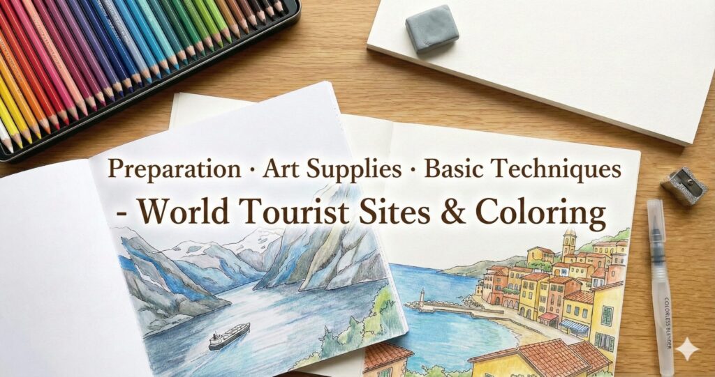
Coloring tourist landmarks is something I believe is decided 80% by preparation rather than by the line art itself.
Even with the same drawing,
colors may not go on well if the paper isn’t suitable,
mist can look rough if the pencil core is too hard,
or rocks may appear flat and heavy if the pencil is too soft.
And there’s one more important point.
Landscapes around the world each have their own “color of the air.”
The Mediterranean tends toward warm yellow tones, deserts toward reddish hues, and Nordic regions toward cool blues.
If you color without considering this, the scene often ends up looking somehow “not quite right.”
In this article, you’ll learn what to know before coloring landscapes, nature, and architecture:
- better material choices
- coloring methods that reduce common mistakes
- tips on adjusting color tones by region
Finally, as a practical example, we’ll introduce basic techniques for recreating a Norwegian fjord—including rocks, water, and mist—through coloring.
Conclusion First (For Busy Readers)
- If you’re unsure, choose colored pencils and thick matte paper.
- Color landscapes in three layers: base → volume → accent.
- Pick one “atmospheric color” that represents the region and lay it down lightly to instantly create a travel-like mood.
- For Nordic mist, it’s more effective to leave white and subtract color rather than adding white.
Table of Contents (Jump to Any Section)
- Think in Three Layers for Travel Coloring (Expressing landscapes step by step)
- Preparation Checklist: Paper, Tools, and Setup (Reducing mistakes in the shortest time)
- Beginner Art Supply Sets (Minimum / Enthusiast / By purpose)
- Basic Techniques: Layering, Gradients, and Edge Handling (Universal methods)
- Regional Color Tendencies: Nordic / Mediterranean / Desert / Tropical / Night scenes
- Basic Techniques for Buildings (Stone, wood, white walls — usable in any country)
- Nordic Example: Coloring Rocks (Cool gray to blue-gray)
- Nordic Example: Coloring Water (Creating depth with ultramarine to teal)
- Nordic Example: Coloring Mist (Subtraction rather than addition)
- Color Recipes (Cool-tone gradients / Mist effects)
- 10-Minute Quick Process (For low-focus days)
- Free Download: Practice Templates (A4)
- FAQ
Think in Three Layers for Travel Coloring (Expressing landscapes step by step)
If you start coloring from the details right away, you’ll usually lose your way halfway through.
Travel landscapes contain a lot of visual information, so I always break them down into three layers.
- Base (foundation color): a thin layer that sets the overall temperature and mood
- Volume (form and depth): a mid-to-dark layer that builds thickness and shape
- Accent (texture and atmosphere): the layer that creates a sense of place using the darkest shadows, highlights, and haze
The basic rule for depth is simple:
The farther the distance, the lower the saturation and the closer to gray.
The closer the foreground, the stronger the contrast.
Preparation Checklist: Paper, Tools, and Setup (Reducing mistakes in the shortest time)
This may seem like a small point, but it’s probably one of the most important.
Especially with travel landscapes, layering is common, so if the paper is weak, you’ll quickly reach its limits.
Paper: Recommended characteristics
- Thick matte paper (approx. 135–180 kg equivalent): withstands layering and resists bleed-through
- Surface that isn’t overly smooth: makes blending mist and sky much easier
- Marker paper if using markers: Even with the same line art, it needs to be handled differently from when using colored pencils or crayons.
You can color on copy paper. It works—but…
Blending effects for mist, sky, or water tend to become rough, so it’s best to treat it as practice paper.
Preparation: Three Simple but Important Points
- Create a test-color area (a margin, a separate sheet, or the edge of the same paper)
- Decide the darkest value first (not by using black, but by choosing the darkest color you will use)
- Fix the coloring order (for example: sky → background → buildings → foreground → finishing touches)
Coloring may look free and spontaneous, but in practice it’s often a matter of sequence.
Once the order is set, hesitation decreases and your hand moves much more smoothly.
Beginner Art Supply Sets (Minimum / Enthusiast / By purpose)
First, let’s take a practical look at what you should buy.
In short, for beginners, ease of use matters more than the number of colors.
Start with just these: a minimum set (no-confusion version)
- Colored pencils, 24–36 colors (not too hard; a type suitable for layering)
- Eraser (a soft eraser, plus a kneaded eraser if possible)
- Pencil sharpener (one that doesn’t easily break the core)
- Thicker, sturdier paper is recommended rather than thin copy paper.
⇒ As a guideline, choose paper about twice the thickness of regular copy paper. It withstands layering better, resists fuzzing, and is less likely to tear when using an eraser.
With this set, you can color scenic travel landscapes properly.
In fact, if you skip these basics and just keep adding tools, it often makes things more complicated rather than easier.
Optional but very helpful: Advanced kit (Faster-Improvement Version)
- Colorless blender: Smoothly blends boundaries in skies, mist, and water surfaces.
- Cool gray / warm gray pencils: Having several gray values dramatically improves landscape coloring.
- White colored pencil (or white gel pen): Useful for adding final highlights—reflections, waves, or sparkles on stone.
- Precision eraser (sharp-edged type): Helps lift thin highlights, such as reflections on water.
- Test paper (small sheet): Try colors on the same type of paper before coloring—surprisingly powerful.
Increasing the range of grays rather than simply adding more colors will greatly enhance the expressive quality of scenic and travel-themed coloring pages.
Shadows in buildings, rocks, and terrain all rely on this foundation.
By use case: Techniques That Improve Expression by Type of Scenery You Want to Color
| Type of Scenery to Color | Tools and materials that enhance the effect when added | Reason |
|---|---|---|
| Sea, Lakes, Rivers | Colorless blender / White colored pencil | Defines water boundaries and reflections clearly |
| Snowy Mountains, Nordic Scenes, Mist | Kneaded eraser / Blue-gray | Allows “subtractive” highlights and creates a cold, airy atmosphere |
| Stone Cities (Europe) | Warm gray / Light purplish gray | Makes stone shadows look natural |
| Tropics, Flowers, Jungle | Range from yellow-green to deep green / Bright cyan | A wide saturation range is essential |
| Nightscapes, Neon | Navy / White pen | Navy often preserves the glow better than pure black |
Basic Techniques: Layering, Gradients, and Edge Handling (Universal methods)
Common mistakes in scenic or travel-themed coloring pages usually fall into these three patterns:
- The streaks or unevenness won’t disappear
- The image looks flat and lacks depth
- The boundaries look harsh, so the sense of atmosphere is lost
The solution is less about advanced technique and more about following a simple method or workflow.
(1)To prevent uneven coloring: Don’t increase pressure—build up more layers instead.
The more you notice unevenness, the more important it is to reduce pressure and build up thin layers.
If you press hard from the start, the tooth of the paper gets crushed and it becomes difficult for additional color to adhere.
(2)To avoid a flat look: Add the darkest tones thinly and deeply in the deepest shadow areas.
If you color every area of a landscape at the same value, the image will look flat.
Instead, place a thin, darkest line or area at the core of the shadow, then softly blend outward so the surrounding tones transition gradually.
(3)To soften boundaries: Blend edges as a soft band of tone, not as a hard line.
Sky and mountains, water and cliffs, mist and rocks—
Instead of separating these areas with a single hard line, create a 2–5 mm “soft transition zone.” This makes the result look much more natural.
Use a colorless blender or a light gray to gently soften both sides of the boundary, as if slightly melting the edge between them.
Regional Color Tendencies: Nordic / Mediterranean / Desert / Tropical / Night scenes
Even when we say “blue sea,” the shade of blue changes depending on the place.
This makes an enormous difference when it comes to coloring.
This is just my personal view, but roughly speaking, the “air color recipes” for different regions look something like this.
| Region | Atmospheric Tendency | How to Adjust Colors (Simple Recipe) |
|---|---|---|
| Nordic (fjords, snow, conifer forests) | Cool / low saturation / bluish tones | Unify the overall tone with blue-gray and cool gray. Even dark areas should avoid pure black. |
| Mediterranean (white walls, stone pavements, strong sunlight) | Warm / yellowish / deep shadows | Use warm gray, ochre, and cobalt. For shadows, mixing in a touch of violet or blue-violet makes the colors stand out. |
| Desert (rock surfaces, red earth, dry air) | Reddish / strong contrast | Use reddish brown, ochre, and dark brown. For the sky, lean toward a bright cyan to convey dryness. |
| Tropical (jungles, beaches) | 彩度High saturation / strong greens | Use a wide range from yellow-green to deep green. Strengthen teal in the sea, and add highlights to express humidity. |
| City nightscapes (neon lights, after rain) | Dark / reflections as the main feature | Avoid overusing black; deepen tones with navy instead. Use a white pen to create small points of light. |
If you looked at this chart and thought, “Wow… this looks difficult,” don’t worry.
What you actually need to do is simple: choose one “air color” that represents the region and lightly lay it over the whole scene.
For example, use a blue-gray for Nordic landscapes, or a warm gray for the Mediterranean.
Just this step creates a sense of unity and instantly makes a travel-themed coloring page feel much more like the real place.
Basic Techniques for Buildings (Stone, wood, white walls — usable in any country)
When buildings appear in scenic coloring pages, they often feel much harder.
But in reality, the opposite is true—once you understand the basic approach, buildings become surprisingly stable and manageable.
The key to coloring buildings is to recognize that shadows behave differently depending on the material.
1)Stone (cobblestones, stone walls, temples, ruins)
- Base: Lightly lay down a thin layer of warm gray or cool gray over the surface.
- Joints (gaps between stones): Don’t draw every line—add thin, darker lines only in key areas.
- Texture: Create a grainy feel using stippling and light scumbling; slight unevenness looks more natural than over-detailing.
- Shadows: Add a narrow core shadow; mixing a touch of purplish gray helps it look more like real stone.
Stone looks less realistic when colored too evenly, so let a bit of variation work in your favor.
2)Wood (mountain cabins, piers, pillars in traditional Japanese architecture)
- Grain direction: First decide the direction (vertical or horizontal) and keep it consistent—don’t change it midway.
- Base layer: Even out the surface with a light ochre to light brown base.
- Wood grain: Rather than drawing many dark brown lines, create the sense of grain by building light and dark flow.
- Finishing: Lift a few thin highlights with an eraser to enhance the wood-like appearance.
With wood textures, more lines usually make the surface look cluttered, so it’s better to simplify the grain rather than add too much detail.
3)White walls (Mediterranean towns, houses in snowy regions, churches)
White walls aren’t created by coloring them pure white.
Instead, place a gray (or lightly tinted color) that appears white.
- Shadows: Light gray plus a slight hint of color
(a bluish tint for Nordic scenes, a yellowish tint for Mediterranean ones) - Highlights: Leave the paper white rather than coloring it
- Outlines: Don’t trace every edge; make only the shadow side slightly sharper
When white walls don’t look three-dimensional, the most common reason is trying to “color them white” instead of shaping them with subtle shadows and contrast.
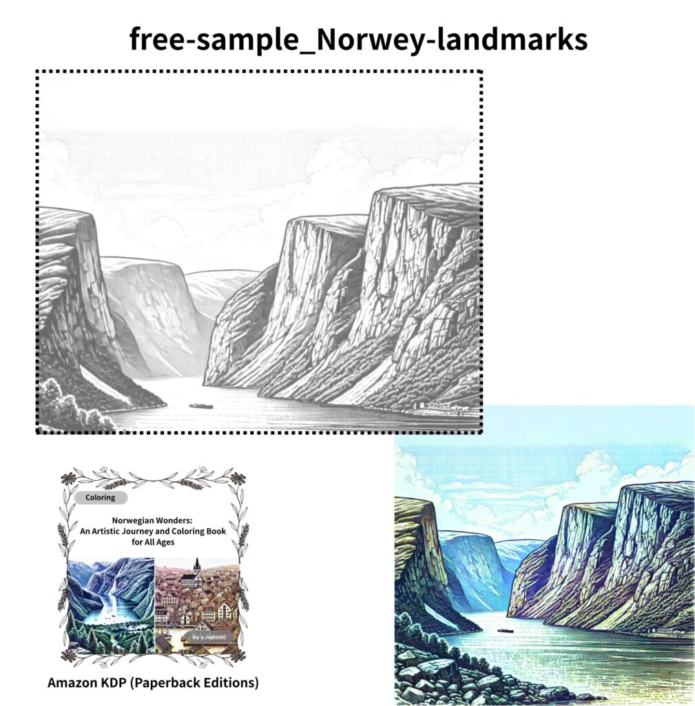
Nordic Example: Coloring Rocks (Cool gray to blue-gray)
Here’s a real example.
When coloring a Norwegian fjord, the main elements can be simplified into three key subjects:
- Rocks: cool grays to blue-grays (rich texture and surface detail)
- Water: ultramarine to teal (depth and reflections)
- Mist (atmosphere): a transparent layer that softens edges (aerial perspective)
Let’s start with the rocks. Because the color temperatureTexture (the surface appearance or feel, such as rough, smooth, etc.) is cool, pay attention to surface direction and texture.
- Base layer: Using light pressure (about HB), apply a thin layer of cool gray (C0–C2) across the entire surface.
- Relief and planes: On cracks and shadowed areas, layer blue-gray (B2–B4) with diagonal strokes, keeping the stroke direction consistent with the plane of the rock.
- Texture: Use stippling and light scumbling to create a granular feel. Mixing in a small amount of warm gray in places can make the rock look more natural.
- Darkest accents: Use the darkest cool gray (C5–C7) plus a touch of navy, applied with very fine lines. Avoid making shadows thick or pure black.
- Highlights: Gently lift color with an eraser or smooth the surface lightly with a colorless blender to restore reflections on raised areas.
With rocks, leaving areas uncolored often creates more depth than drawing more lines.
If the dark areas become thick, the result quickly looks cartoonish—so keep shadows thin, deep, and controlled.
Note:
C0–C2 / B2–B4 / C5–C7 refer, in broad terms, to numbered shades indicating the darkness of colored pencils (mainly gray tones). This type of notation is commonly used in colored pencil sets—especially in international or artist-grade brands—to distinguish gradations from light to dark. We will explain here which specific colors to use for each type or brand of colored pencils you may be using, so you can choose suitable substitutes with confidence.
Nordic Example: Coloring Water (Creating depth with ultramarine to teal)
The surface of a fjord isn’t finished just by coloring it blue.
What makes it convincing is the combination of the sky’s color and the reflections of the surrounding cliffs.
- Base: Lightly layer cyan and ultramarine using horizontal strokes (horizontal strokes create a calm feeling).
- Reflections: Add gentle vertical variations, imagining the colors of the cliffs mirrored upside down.
- Depth: Darker in the foreground, lighter in the distance. Layering a touch of teal in the darker foreground areas quickly adds depth.
- Highlights: Scatter small reflections with a white colored pencil, or lift thin highlights with an eraser.
When you notice unevenness on the water’s surface, a common mistake is pressing harder in an attempt to make the color uniform.
But in fjord scenes, that tends to “lock in” the unevenness and makes it difficult to correct.
Instead, reduce pressure and build up more layers—that’s the fastest way to achieve a natural result.
Nordic Example: Coloring Mist (Subtraction rather than addition)
In Nordic landscapes, mist is often the key element—and This part needs to be handled differently.
Mist isn’t “white”; it’s transparent.
- After laying down color, lightly lift the edges with a soft eraser or kneaded eraser to soften the boundaries.
- Use a colorless blender to gently dissolve only the contours, creating a transparent layer.
- Mist tends to spread horizontally, so build it up in soft horizontal bands with subtle differences in lightness.
If the area becomes too washed out, lightly glaze a very pale blue-gray over the mist.
This restores the sense that there is air inside the mist, rather than a flat white patch.
Color Recipes (Cool-tone gradients / Mist effects)
When in doubt, start here. Follow the basic method.
| Purpose | Color Order (Light → Dark) | Key Points |
|---|---|---|
| Depth of Water | Cyan → Ultramarine → Teal → Navy | Use horizontal strokes; make the foreground darker and the distance lighter. Lift small highlights with white. |
| Cold Texture of Rock | Cool Gray C1 → Blue Gray B2 → Cool Gray C4 → Navy | Keep cracks as fine lines; use diagonal strokes on surfaces, aligning the stroke direction with the plane of the rock. |
| Distant Mountain Shadows | Light Blue Gray → Light Gray → Very Pale Violet Gray | Lower the saturation and keep contrast to a minimum. |
Mist Rendering: 3 Tips to Avoid Mistakes
- After laying down color, use a colorless blender to soften boundaries with small circular motions.
- Use an eraser to lift brightness in horizontal bands, creating layered, translucent mist.
- Slightly sharpen the outlines of foreground elements—such as trees or rooftops—to enhance the sense of depth.
10-Minute Quick Process (How to Color on Low-Focus Days)
Even on days when you feel, “I can’t concentrate today…,” a fjord scene can take shape in about 10 minutes.
Rather than aiming for perfect detail, prioritize the atmosphere.
- 1 minute: Lightly lay a base of cool gray over the whole area to set the overall temperature.
- 3 minutes: Add depth only to the rock shadows with B2–B4 blue-gray. Don’t draw every crack. ・・・See “B2–B4” in this blog, Chapter 07: Nordic Example – Coloring Rocks, for details.
- 3 minutes: Color the water with horizontal strokes, moving from cyan to ultramarine, keeping the distant areas lighter.
- 2 minutes: Add teal to the foreground water to create depth—this is where the scene really comes alive.
- 1 minute: Use an eraser and a blender to soften only the edges of the mist. Don’t add white.
Interestingly, leaving some areas unfinished often brings out the quiet, serene atmosphere typical of Nordic landscapes.
Free Download: Practice Templates (A4)
Free Download Box (Download → Print → Use)
- Download: Download the PDF from the link below (permitted for personal, at-home use).
- Print: A4 size, 100% scale, and with margins recommended. Thick matte paper (see note) helps prevent bleed-through.
Note: Use paper thicker than standard copy paper (roughly about twice the thickness of ordinary paper). It resists fuzzing during layering and is less likely to tear when corrections are made with an eraser.
Terms of Use: Secondary distribution, commercial use, redistribution, and use as AI training material are prohibited. Copies for classroom use or household activities are allowed (source attribution recommended).
①Free Template for Nature & Basic Techniques:Norwegian Fjord Line Art (A4)
・echnique: Refer to the “cool color gradient” method in this article, and build the layers in this order: rocks → water → mist.
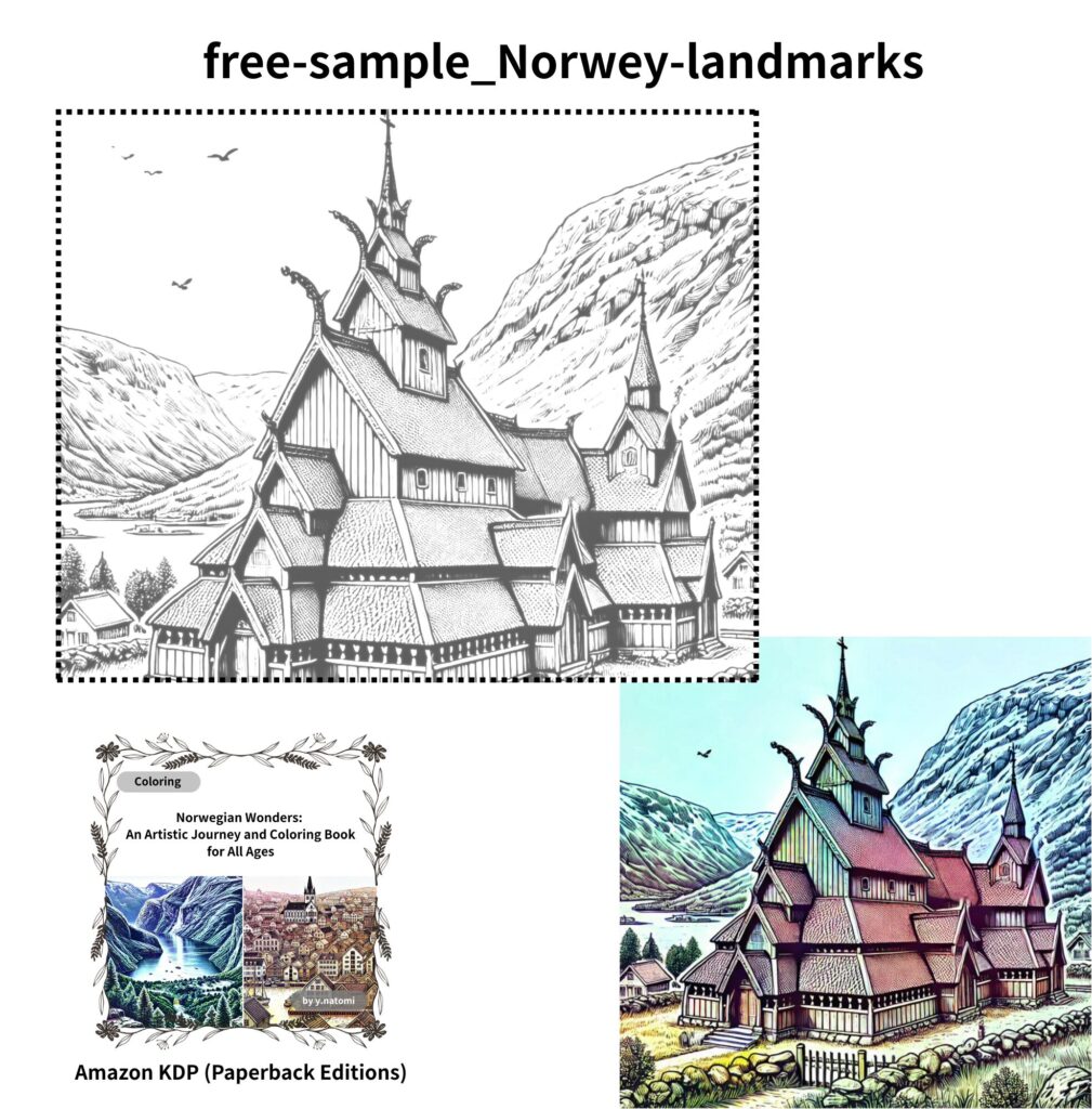
②Free Template for Buildings & Basic Techniques :Norwegian Wooden Church Line Art (A4)
・Technique: The recommended order is a simple three-step process: roof (shadows) → walls (wood grain) → decorations (final accents).
- Details: For window frames, columns, and carvings, add a darker color at the end, using thin and deep lines to enhance the sense of depth.
2. Roof: First, use a light gray (or bluish gray) to establish the direction of the shadows.
3. Walls: Rather than drawing wood grain with lines in light to dark brown, create the flow of the grain through variations of light and shadow.
FAQ
Q1. The water surface looks patchy and uneven.
A. Keep the width and pressure of your horizontal strokes consistent, and smooth the area by building up three or more thin layers.
Lightly use a colorless blender midway, then place small highlights with a white pencil at the end. This draws the viewer’s eye away from uneven areas and helps the finish look more refined.
Q2. The rocks look flat.
A. Create texture using diagonal strokes that follow the direction of the surface, combined with stippling.
Add the darkest shadows in thin, deep lines, and lift narrow highlights with an eraser to increase the contrast range. This will bring back a sense of depth and volume.
Q3. The mist looks washed out (too white).
A. Mist should be treated as a transparent layer. Instead of erasing the underlying color completely, soften only the edges with a colorless blender.
Keep the brightness differences subtle—layering small variations of about 5–10% in value creates a more natural effect.
Q4. The straight lines of buildings look distorted.
A. Adding too many shadow lines can make structures appear warped.
Avoid tracing the entire outline; instead, keep only the shadow side slightly sharper. This helps maintain clean, stable shapes.
Next to Read
- “Color Basics: Hue, Saturation, and Value” – World Landmarks & Coloring (Coming soon)
- “Texture Practice: Stone, Water, and Metal” – World Landmarks & Coloring (Coming soon)
Return to the Pillar Article (Summary):World Travel Destinations & Coloring: A Country-by-Country Guide